-
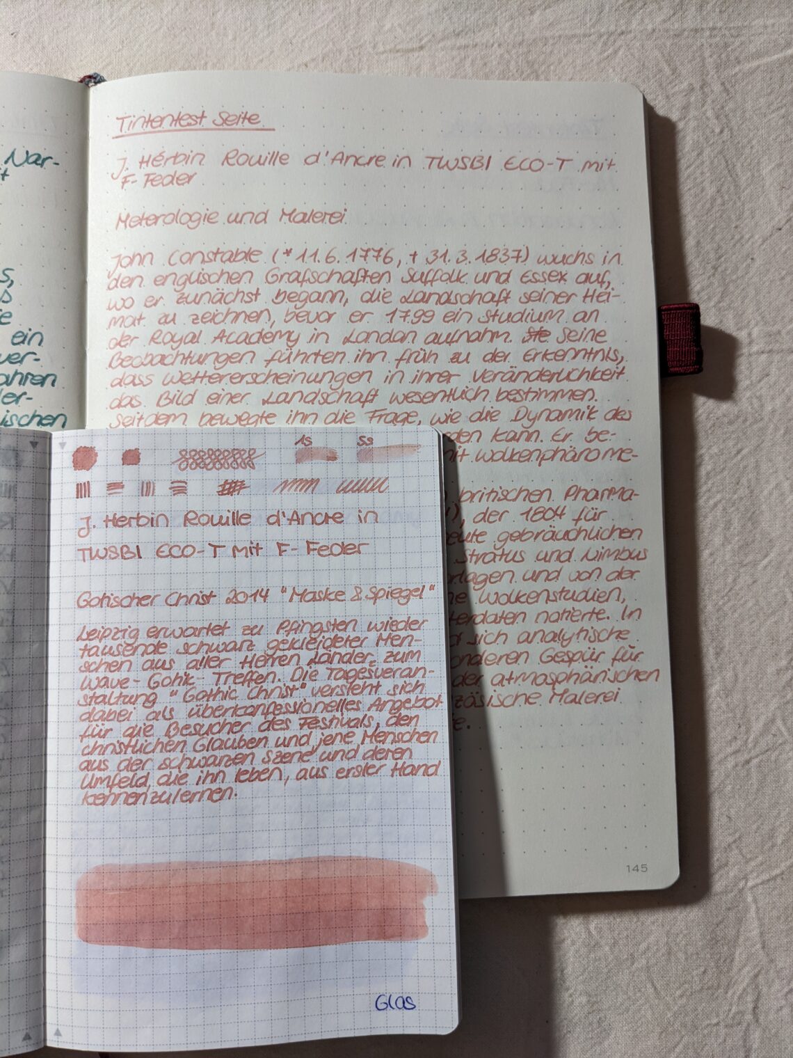
J. Hérbin Rouille d’Ancre
Reviwe of J. Hérbin Rouille d’Ancre, coming in a 10ml glass bottle. Es handelt sich um einen hellen Rosé-Ton, kann auch in der Kategorie Beige, Hauttöne oder Rosa mit einsortiert werden. Beim Schreiben ist es ein recht heller Ton, der bei schwacher Beleuchtung schwierig zu sehen ist, vor allem wenn von der vorherigen Seite eine dunklere Tinte durchschimmert. Die Tinte trocknet dann aber dunkler aus, sodass man sie letztendlich gut erkennen kann. It’s a rather bright rose ink, maybe other words could be beige, bright skin color or even pink. While writing with it the color is very bright and it’s not easy to see it on the paper, especially…
-
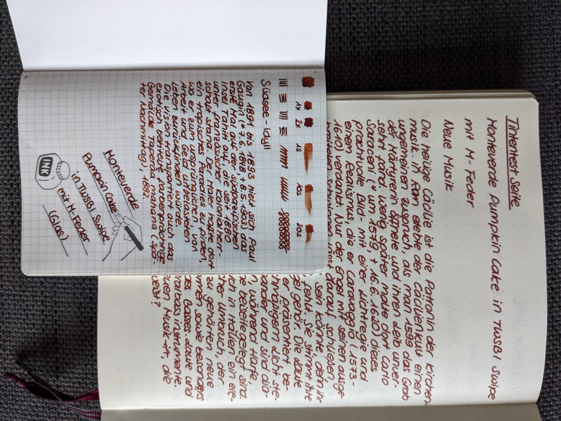
Monteverde Pumpkin Cake
Ink review of Monteverde Pumpkin Cake Comes in a glass botte, 30 ml. Dieses Review hat ein bisschen Zeit beansprucht, weil ich die Tinte auf mehreren Papieren getestet habe. Es handelt sich um einen warmen Braunton, fast so als hätte man Schokolade mit Kürbis gemischt. Der Name passt also perfekt! Falls es Menschen gibt, die Tinte nach Jahreszeiten verwenden: diese Tinte ist flüssiger Herbst. This review tooks some time, because I tried the ink on different papers. It’s a warm brown color, almost as if you mixed choclate with some pumpkin. The name fits perfect! If you choose your inks according to seasons this one would fit perfect to autumn.…
-
Paper for Fountain Pens and Inks
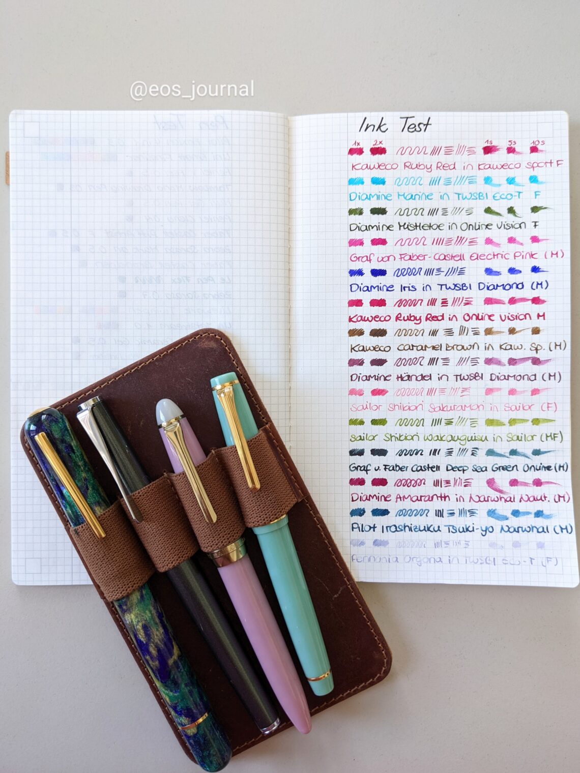
It’s a never ending discussion about what’s more important: the ink, the fountain pen or the paper? Does every ink write in the same way in every fountain pen and on every paper? Spoiler: No. For me the paper is really important. There are so many differences: the texture can be soft, it could be coated, it could be smooth or rough. And then there’s also the possibility that the ink “sits” on the paper or soaks into it. So while making ink swatches I always test the inks on different papers. Coming from the bullet journal community I have a lot of journals and different kind of papers at…
-
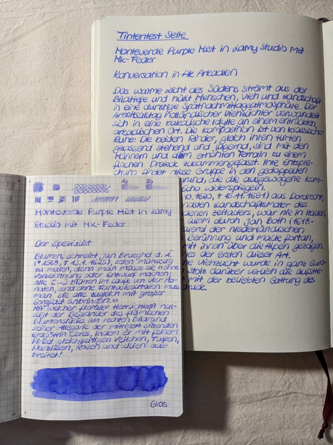
Monteverde Purple Mist
I’m back with another ink review – and I thought I will add the german text as well for all my german speaking followers. Monteverde Purple Mist, 30 ml, glass bottle Heller Violett-Ton, beim Schreiben wirkt es zunächst etwas rosa, trocknet jedoch mit deutlich blauem Einschlag. Eher fließfreudig, keine Rückstände, Pigmente, Glibber o. ä. im Glas. Kein Shimmer oder Sheen vorhanden. In meinem Lamy Füller zeigt sich deutliches Shading auf Tomoe River, die hellen Bereiche sind dabei sehr hell und ggf. für manche Menschen schwer zu lesen. Bright violet, while writing it’s rather pink but turns more to blue while drying. It’s pretty fluent, I didn’t find any pigments, glibber…
-
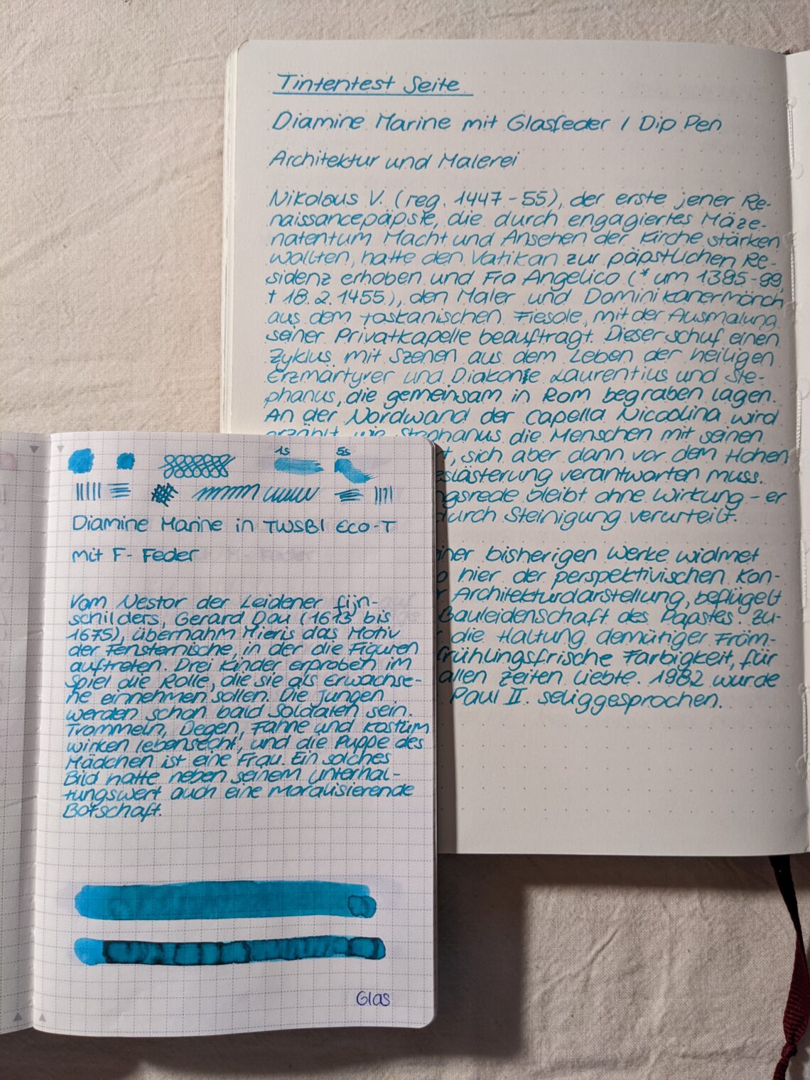
Diamine Marine
This color is a bright teal, turquoise or sea blue. It reminds me a little bit of the stone turquoise, although the color is a little bit darker. I’d say its a blue tone with a little bit of green inside. While writing on my Tomoe River Paper you can see a little bit of shading, the differences between the lighter and the darker parts of the lines is less prominent than in other inks. I was surprised to see a little bit of red sheen in the swatch on the bottom of the page. It is not visible in the written text passages. On Leuchtturm 120gsm paper, where I…