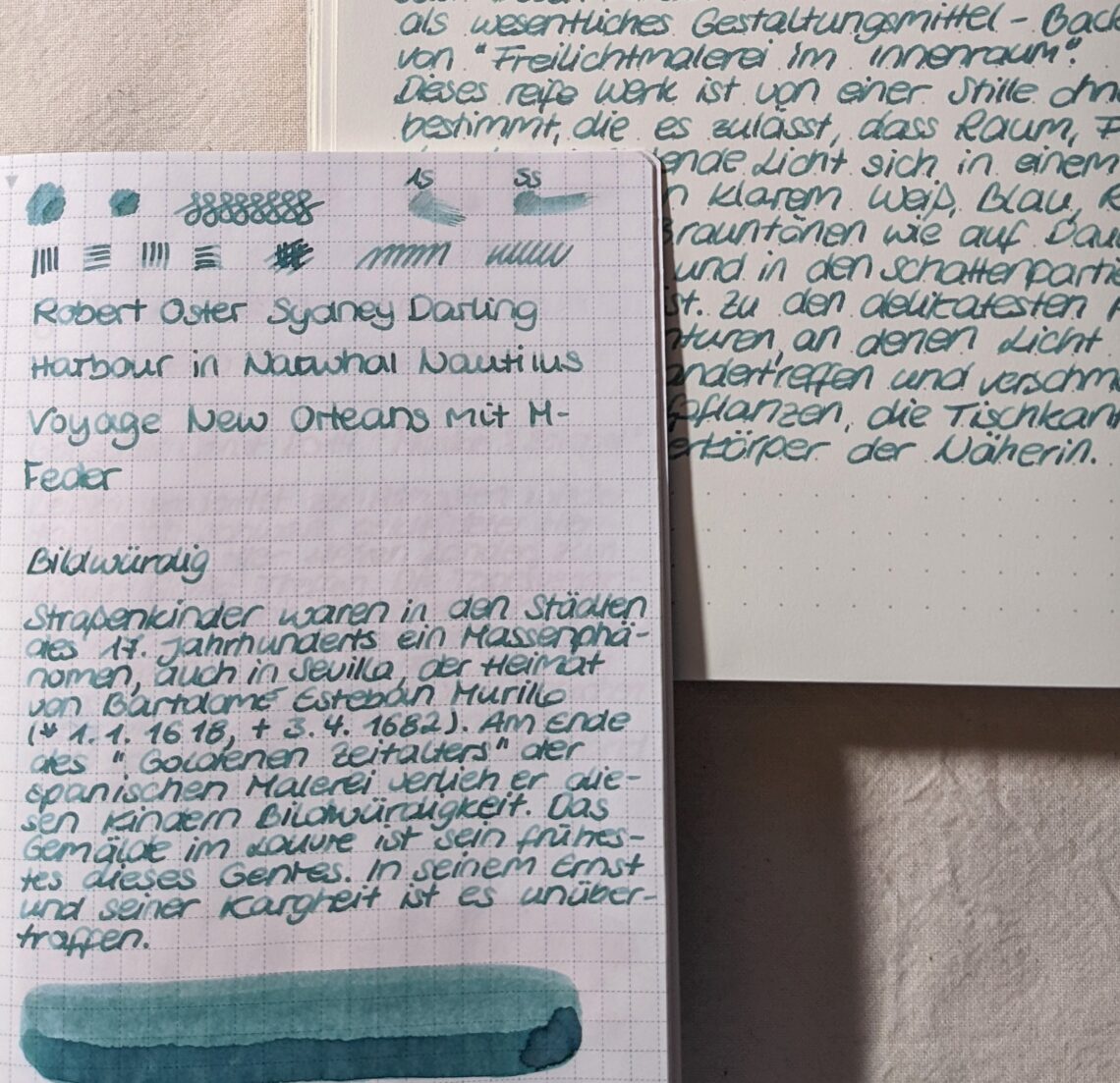
Robert Oster Sydney Darling Harbour
The color changes between dark green, grey green and blue green. I’d describe it as blue green. It’s a beautiful ink with a lot of shading, the flow is rather wet. I didn’t have any problems writing with this ink, also there haven’t been any things like crumbs, pigments or glibber in the ink.
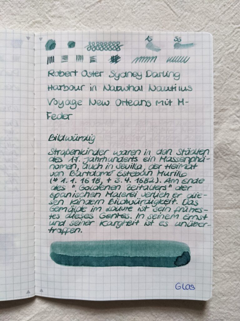
As you can see there is a lot of shading going on in this ink. It’s a rather light ink apart from the darker pools. It may be too light for some people on white paper.
The shading is less prominent on Leuchtturm Paper and the whole writing looks a little bit calmer. The lighter parts of the ink seem to be a little bit darker than on Tomoe River Paper, so reading is a bit easier.
I prefer to use this ink on Tomoe River Paper, because I really like the shading.
The fountain pen I used was Narwahl Nautilus Voyage New Orleans with M-nib.
Nothing in this review was sponsored, I paid everything with my own money.

