Diamine Marine
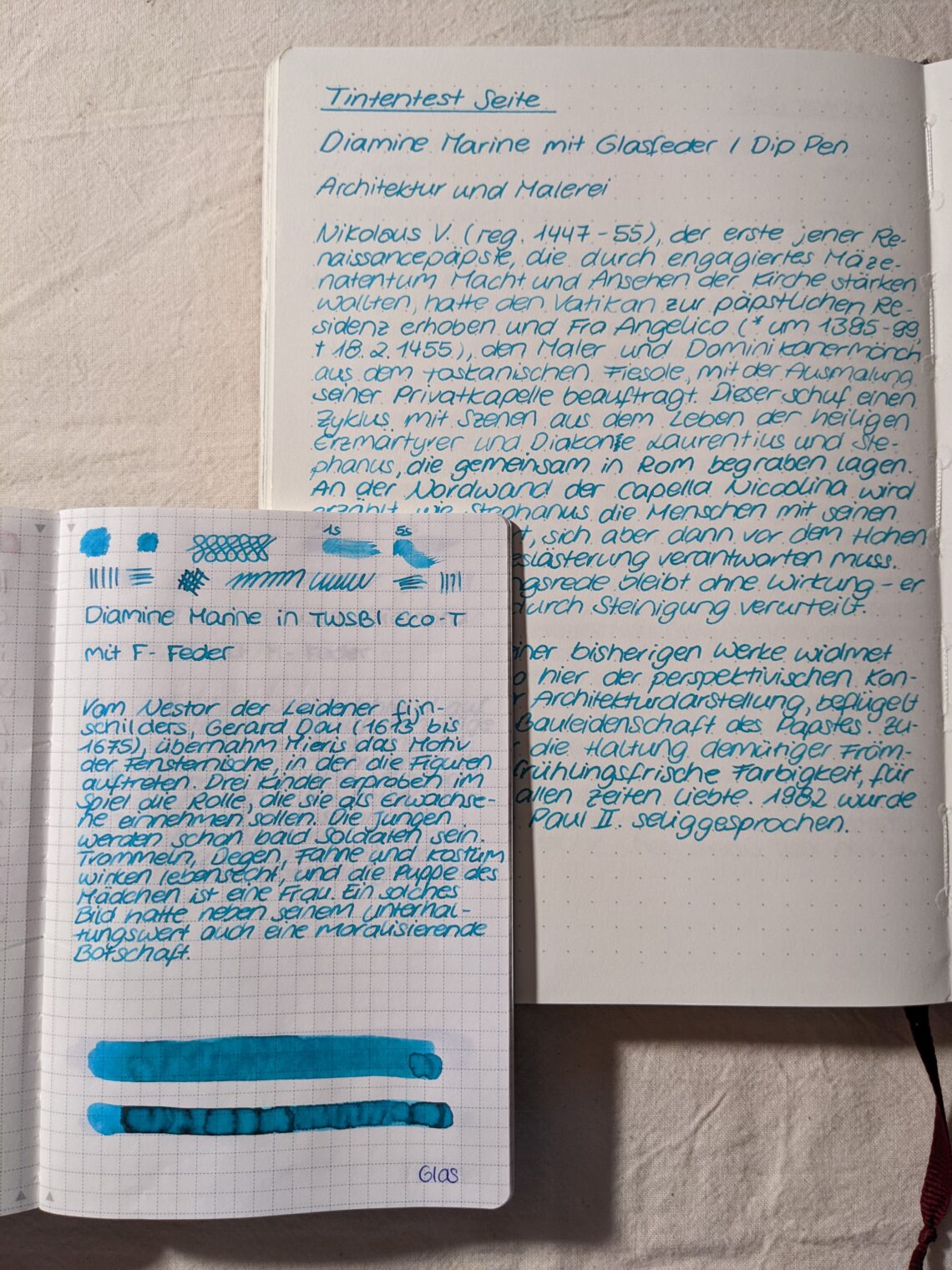
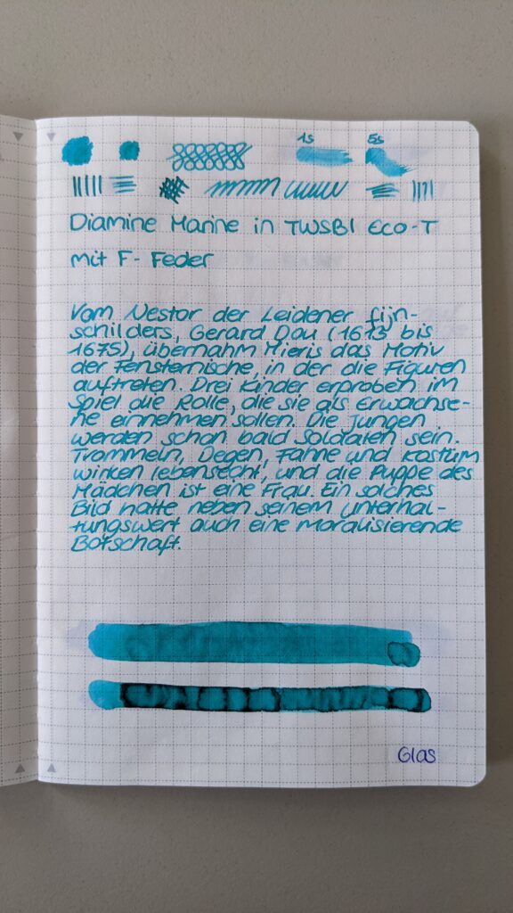
This color is a bright teal, turquoise or sea blue. It reminds me a little bit of the stone turquoise, although the color is a little bit darker. I’d say its a blue tone with a little bit of green inside.
While writing on my Tomoe River Paper you can see a little bit of shading, the differences between the lighter and the darker parts of the lines is less prominent than in other inks.

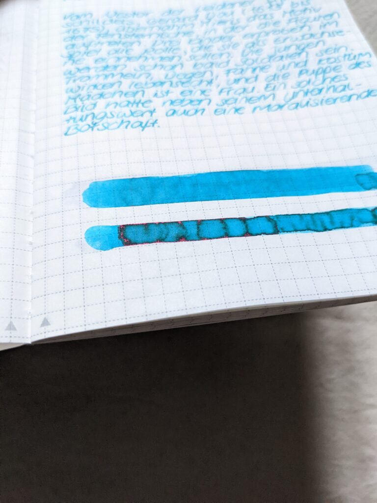
I was surprised to see a little bit of red sheen in the swatch on the bottom of the page. It is not visible in the written text passages.

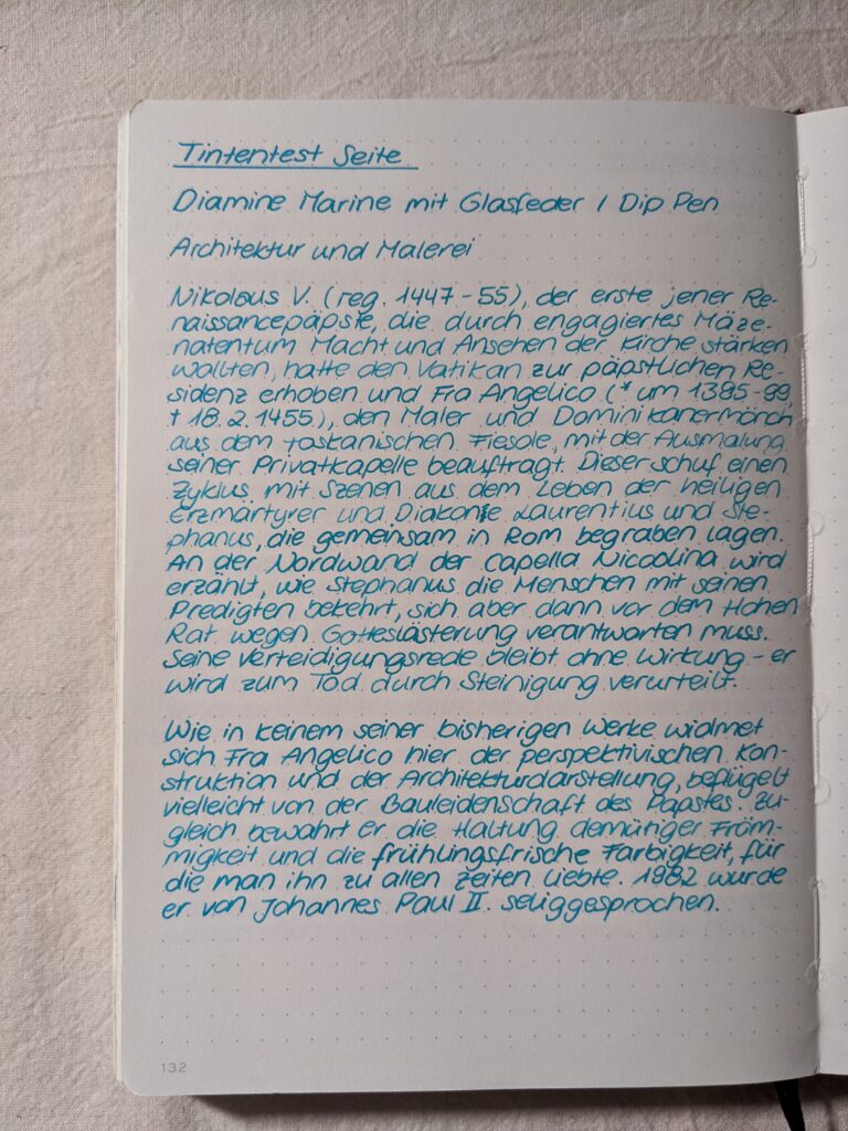
On Leuchtturm 120gsm paper, where I used my Glas Dip Pen, you can see almost none of the shading I mentioned before. The color seems to be a little bit more green – maybe due to the yellowish color of the paper?

Overall I think this is a really good ink. I didn’t have any problems while using it (most of the time in my TWSBI Eco-T with F nib) which made me happy. I also feel like blue colors are more accepted in the business world – so this one fits there as well. I used it a while on a daily basis for meetings and other notes – the ink worked well for this purpose.
Nothing in this review was sponsored, I paid everything with my own money.

