Sailor Manyo Koke
I tried some Dual Shading or Multi Shading inks in the last few weeks but there wasn’t one ink that could make me really happy. Sailor Manyo Koke was going to be the last I wanted to give a try – at least for a while.
Ich hab ja schon ein paar Dual Shading Tinten ausprobiert und war bisher nicht so richtig begeistert. Die Koke sollte mein zunächst letzter Versuch sein mit diesen Tinten warm zu werden und den Spaß daran zu entdecken.
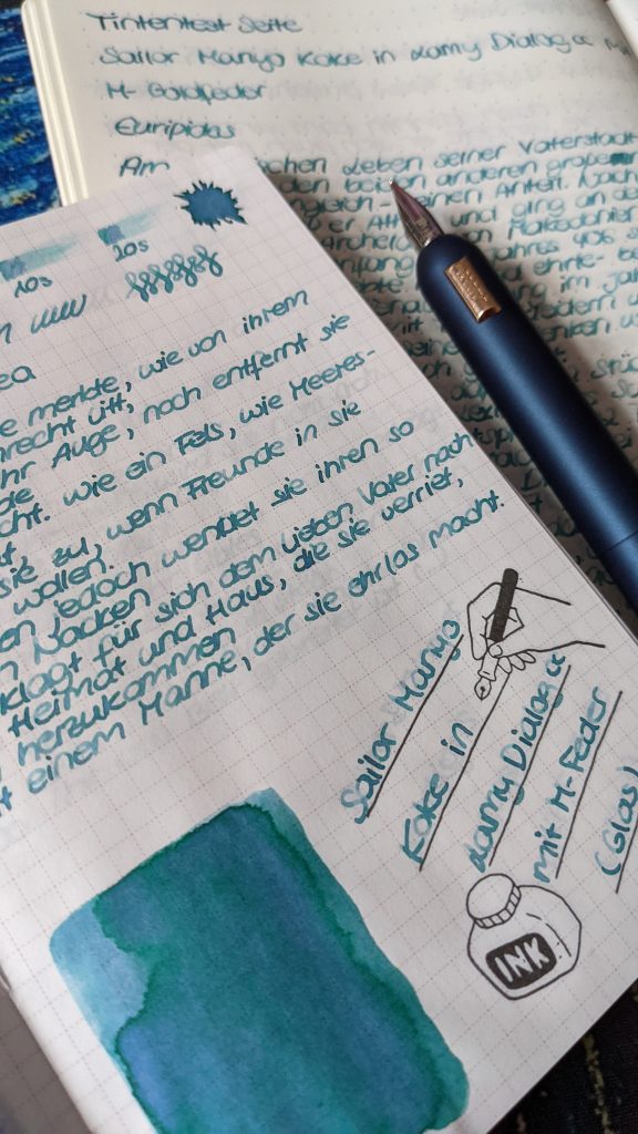
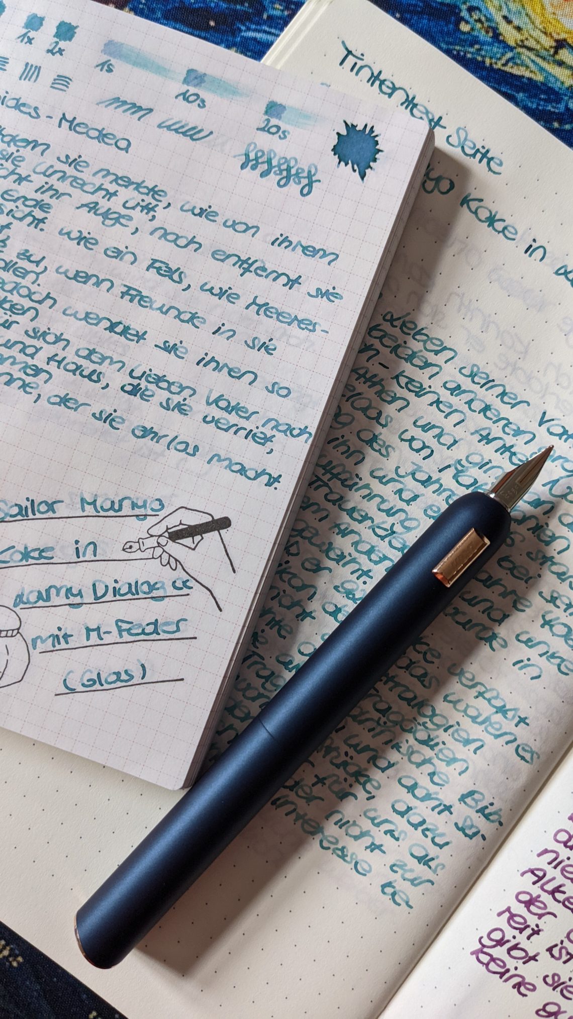
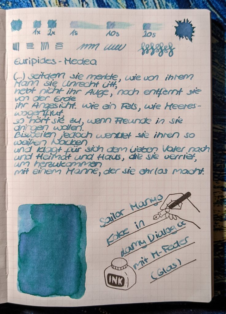
The ink is available in a 50 ml glass bottle. The color is a bright turquoise or teal tone.
Sailor Manyo Koke kommt in einem 50 ml Glasfläschchen. Es handelt sich um einen hellen, türkisfarbenen Farbton.
While testing my other inks before (also from Sailor and some from Pennonia) I always had one big problem: I wasn’t able to read them well on Tomoe River Paper. Therefore they haven’t been useful for my daily meeting or work notes. Even on Leuchtturm paper the shading was too much. Looking on the Sailor Manyo Koke there are still differences between the lighter and the darker parts of the written text, but I was able to read them because of the in general darker blue color.
Bei meinen anderen Tinten der Art (Sailor Seki, mehrere Pennonia) konnte ich auf Tomoe River Papier leider nichts lesen und selbst auf dem Leuchtturm Papier war das Shading zu krass. Dadurch waren sie im Alltag für mich nicht zu gebrauchen. Bei der Sailor Manyo Koke sind zwar auch immer noch deutliche Unterschiede zwischen dem hellen und dem dunklen Teil bei geschriebenem Text vorhanden, aber durch den grundsätzlich dunkleren blauen Farbton der Tinte einfacher zu entziffern.
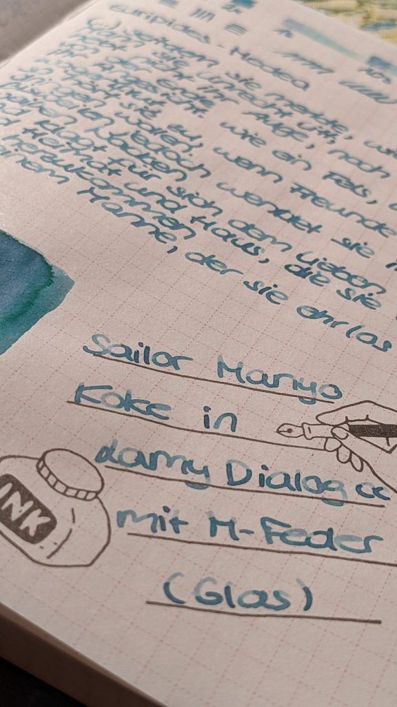
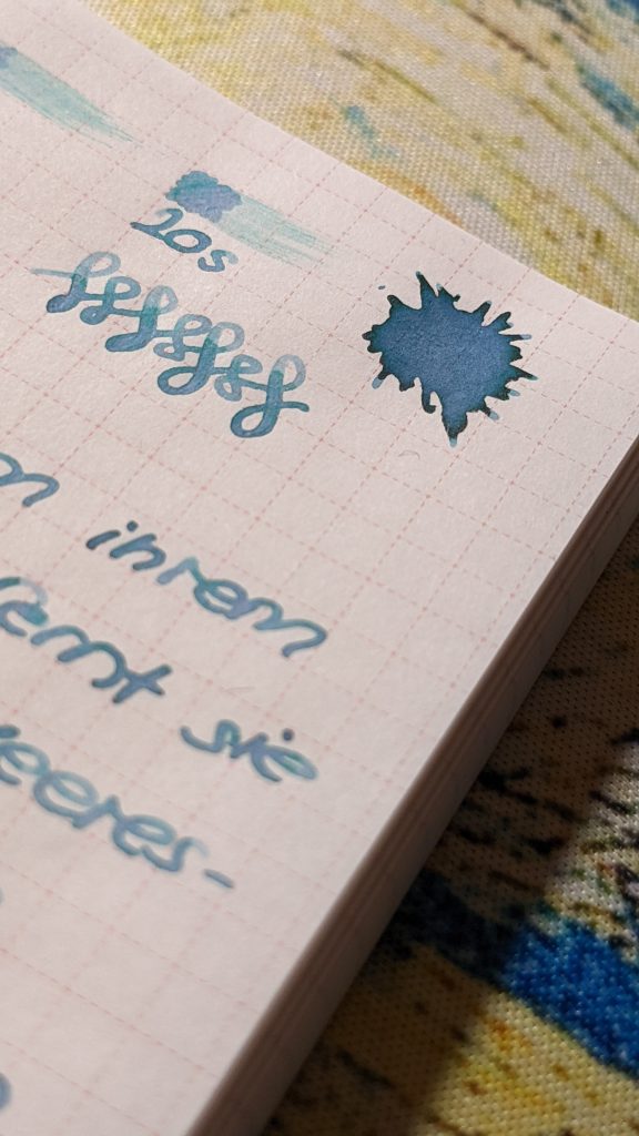
Lets talk about the most important thing: the duo shading. On Tomoe River Paper you can see in the big ink blob the darker blue and inside the lighter violet and a lottle bit of green. Also in the written text some shading is visible.
Kommen wir aber nun zu dem wichtigsten Teil: dem Duo Shading. Auf Tomoe River Papier zeigt die blaue Tinte im großen Tintenklecks ein deutliches Shading in grün und fliederfarbenem violett. Auch im Geschriebenen sieht man hier und dort violettes Shading.
On other papers I couldn’t find any shading at all. The ink is “just” turquoise / teal.
Auf anderen Papieren konnte ich leider nichts vom Shading erkennen. Dort ist die Tinte einfach nur türkis.
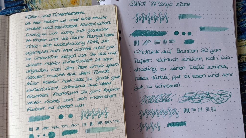
The ink very thin and wet. It pools very easily so you’ll get a lot of areas where shading can be visible. Also sometimes the ink feels too fluent and thin sometimes. I’m not sure if I like this ink but I will try to write with it in the next months and in different fountain pens. Of all tested Multi-/Duo-Shading inks I tried so far I like Sailor Manyo Koke the most.
Die Tinte ist sehr flüssig. Es bilden sich sehr leicht kleine Pools. Gleichzeitig wirkt sie aber auch etwas zu dünnflüssig. Ich bin mir nicht sicher, ob diese Tinte mir gefällt. Von allen bisher von mir getesten Multi- / Duoshading Tinten ist Sailor Manyo Koke aber definitiv die beste.

